Monday, August 12, 2013

Free download: 48 flat designer icons


The flat design juggernaut continues to roll on, crushing everything in its path. With an emphasis on simplicity, it’s easy to manage basic design principles when you’re working flat.
Essential to any flat design is a consistent set of icons, so we’re delighted to be able to bring you this free set of 48 office, social and travel icons, designed by our friends at Vecteezy.
Supplied as .ai and .png files, these fabulous icons in three complimentary styles — full color and monochrome coral — are fully scaleable and add a touch of flat design to any website.
Download it from:
http://www.webdesignerdepot.com/2013/08/free-download-48-flat-designer-icons/


Which Mustache Do You Like Most?

According to Wikipedia, a moustache is facial hair grown on the upper lip. It may or may not be accompanied by a type of beard, a facial hair style grown and cropped to cover most of the lower half of the male face. Moustaches can be groomed by trimming and styling with a type of pomade called moustache wax.

Here you can free download the kinds of mustaches and choose the best one for yourself.


Free Download: http://goo.gl/odRxwl

How to transition app designs to iOS 7


There’s been a lot of talk about iOS 7 since its unveiling earlier this month and most of it has been centered around the design, in particular the new icons. Now, as we’ve all had time to mull over the changes, questions are beginning to be asked about how they will affect the design of our own apps. As a result, a debate has broken out about how much of an influence iOS 7′s new UI should have.

While some believe that apps should remain true to their own style and shouldn’t be redesigned purely to match the look of iOS 7, others believe that apps should be redesigned in order to make them feel more native. To add to this, there appears to be some confusion over how strict actually are. 
In an effort to clear things up, I’ve taken a long look at the documents within
and will use this post to share some of my findings.

Understanding Apple’s guidelines

With regards to the debate over whether all apps should now adopt a “flat” aesthetic, it’s purely a matter of opinion. If you use custom UI elements in your design then ultimately stylistic decisions lie with you and your team. Although Apple do suggest that you revisit the use of drop shadows, gradients, and bezels, I’ve seen no evidence to suggest that this is a strict requirement.
In the snippet of text below, taken from the iOS 7 UI Transition Guide
, more details are given on different levels of customization and how each will affect the amount of work that you need to do in order to prepare your apps for the transition.
Think of app customization as being divided into the following three types:
    • Standard. The app contains only standard, uncustomized UI elements provided by UIKit.
    • Custom. The app presents a completely custom UI that doesn’t include any UIKit UI elements.
    • Hybrid. The app contains a mix of standard and custom elements, including standard elements that you customized using UIKit tinting and appearance-customization APIs.
    For a standard app, you need to decide whether your visual and user experience designs still make sense in the iOS 7 environment. If you decide to keep the current layout and interaction model, most of the work involves making minor adjustments and ensuring that the app handles the new systemwide gestures correctly.
    Custom apps—that is, apps that use no UIKit UI elements—require a more nuanced approach. For example, if you feel that the current UI and experience of the app is still appropriate, there may be very little to do. On the other hand, if you feel that the app’s personality and user experience should change in order to delight iOS 7 users, you have more work to do.
    Hybrid apps vary in the amount of work required, depending on the customizations you did and how you combined custom and standard elements. In addition to revisiting the overall design of a hybrid app, you need to make sure that your customizations still work well and look good when they’re integrated with standard elements.
    It’s also noted at the end of the document quoted above that an app that mimics standard iOS 6 UI in a completely custom way is likely to require a lot of work because it will simply look out of date. This is certainly a prospect that you’re going to want to consider.
    Also taken from the iOS 7 UI Transition Guide is the text below, which features two lists — things every app must do and things every app should do. Given the change in language, I’d consider the first to be a list of strict requirements and the second to be a list of things that at the very least should be given some thought.
    Things every app must do
    • Update the app icon. In iOS 7, app icons are 120 x 120 pixels (high resolution).
    • Update the launch image to include the status bar area if it doesn’t already do so.
    • Support Retina display and iPhone 5 in all your artwork and designs, if you’re not already doing so. 
    Things every app should do
    • Make sure that app content is discernible through translucent UI elements—such as bars and keyboards—and the transparent status bar. In iOS 7, view controllers use full-screen layout (to learn more, see Using View Controllers).
    • Redesign custom bar button icons. In iOS 7, bar button icons are lighter in weight and have a different style.
    • Prepare for borderless buttons by moving away from supplying button background images and by reassessing your layout.
    • Examine your app for hard-coded UI values—such as sizes and positions—and replace them with those you derive dynamically from system-provided values. Use Auto Layout to help your app respond when layout changes are required. (If you’re new to Auto Layout.
    • Examine your app for places where the metrics and style changes of UIKit controls and views affect the layout and appearance. For example, switches are wider, grouped tables are no longer inset, and progress views are thinner. For more information on specific UI elements
    • Adopt Dynamic Type. In iOS 7, users can adjust the text size they see in apps. When you adopt Dynamic Type, you get text that responds appropriately to user-specified size changes. For more information.
    • Make sure your app doesn’t respond inappropriately to the new Control Center gesture or to a navigation controller’s swipe to go back gesture, especially if you perform custom touch handling.
    • Revisit the use of drop shadows, gradients, and bezels. Because the iOS 7 aesthetic is smooth and layered—with much less emphasis on using visual effects to make UI elements look physical—you may want to rethink these effects.
    • If necessary, update your app to best practices for iOS 6—such as Auto Layout and storyboards—and ensure that the app uses no deprecated API.
    iOS 7 doesn’t mean the end of the ultra detailed app icon either. The snippet of text below, suggests there is still a place for realism. However, as mentioned above, all app icons will need to be updated.
    If you want to portray real substances, do it accurately. Icons or images that represent real objects should also look as though they are made of real materials and have real mass. Realistic icons accurately replicate the characteristics of substances such as fabric, glass, paper, and metal, and convey an object’s weight and feel.

    To summarise

    Although there is a lot more to the documents within Apple’s iOS 7 Design Resources, and I would recommend reading through them all, I felt that these three snippets in particular provide some much needed clarity. Apple’s new approach may do it’s best to shun drop shadows, gradients, and bezels, but it doesn’t mean that you have to follow suit, and whether you should or not is purely a matter of opinion.
    Regardless of what stylistic choices you make, as long as you carefully consider all of the above, then you should have no problem in successfully transitioning your apps to iOS 7.

    article source: http://www.webdesignerdepot.com/2013/07/how-to-transition-app-designs-to-ios-7/

    Thursday, August 8, 2013

    Tips for a Perfect Wedding Website


    You've probably RSVP’d a few times already, or bought a gift.
    It’s wedding season.
    Summer and fall months are a popular time for nuptials. And couples are finding that a great wedding website is a great way to communicate with family and friends without a lot of added expense. What started as a small trend is becoming more and more popular.
    A website can serve as a save the date, wedding information portal (registry information, dress code, directions and more), and place to share photos and videos.
    While many couples may opt for an out-of-the-box template-style wedding website, you can make your site stand out from the others. A dedicated wedding site is more personal that a simple Facebook page, and is more accessible to those who (gasp!) might not use social media.
    Here we share some tips for creating a great wedding site and examples with a lot of personality – and you don’t have to rely on script typefaces and pink ribbons.

    Emphasis on Landing Page

    Jess
    Pittmans
    A wedding website can be as simple as a single-page design or as complicated as you can imagine. But the landing page is of utmost importance.
    The wedding site landing page (or homepage) should communicate three things: The couple should be clearly identifiable, the wedding date should be visible and all other navigation should be clear and easy to find.
    The information a couple decides to put on the page can vary but should often include event information and directions (include accommodation information for out of town guests), wedding-related events, RSVP, gift registry link and contact information.

    Make it Personal

    Best Friend
    Our9
    Dylan Megan
    Gosia
    The most important part of designing a wedding website is personalization and personality.
    Your site should reflect who you are as a couple. The theme should match your personality – fun, formal, nontraditional or quirky.
    There are no rules when it comes to what a wedding site must look like. It should appeal to the couple as a whole. (Too many wedding templates feature a feminine look that is not always universally appealing.) Opt for typefaces and colors that both of you like. Consider pulling the idea for the theme for the big day into the web design, using the same colors and typefaces.
    Use the site to tell your story. How did you meet or come to be a couple? What path led you to marriage? Remember some of your guests may not know the full story; this can help them better connect with you before the big day.

    Include Photos and Updates

    Ashley Jeremy
    Andy Lindsay
    Jenny and Grayden
    Nick Kristen
    Another way to personalize your site is to include plenty of photos and wedding updates. Some sites go as far to include a blog, which can be a fun way to share wedding news.
    Adding photos is a great way to get a lot of bang out of all those portraits as well.
    And remember to have fun. Show off your best pictures as a couple – fun moments, portraits and or even photos that showcase some of your favorite places or the wedding venue.
    Many couples also continue to update the site after the wedding, sharing photos from the ceremony and reception or honeymoon.

    Include Event Information

    Tiffany Zach
    Kate Luke
    This may not be the most fun part of your website, but it is the part that will get a lot of clicks from visitors and wedding guests.
    Make sure to include all relevant event information, from where the wedding will be held and how to get there to dress code, dinner and drink options (if applicable) and whether your event is child-friendly.
    Then think about a digital RSVP if you don’t want to deal with paper responses. (This can also save you some return postage.)
    Include gift registry links as well. While some couples may shy away from this idea, it can make it much easier for people who want to buy a gift.
    Finally, make sure to include contact information. Whether it is an email, phone number or physical address, it should be easy for people to find you. Worried about spam or unwanted visitors to your site? Consider using password protection – you can provide the information as a link or in a mailed invitation – or de-listing your site from search.

    Friendly User Interface

    Kevin Kristen
    Ross Jess
    It almost goes without saying, but remember to make your wedding site user friendly.
    Links should be easy to find and click. Navigation should be simple. A wedding site does not have to be massive. Many are even only one scrolling page.
    Consider a mobile friendly version as well or a website built with responsive design.

    Design on Trend

    Courtney and Andrew
    We discuss a lot of trends here at Designmodo and you can make some of these work for a wedding design as well.
    Courtney and Andrew’s wedding site combines three trends into one great site, using flat design, parallax scrolling, and retro color.
    The site has a super-modern look and feel and stands out because of its on-trend look. (We’re guessing from the bios that the site looks so great because Andrew has “a knack for web design and web development.”

    Conclusion

    Wedding websites are increasing in popularity daily.
    Just like the dress, most couples would rather have a site that is unique and perfect for the day. Whether you opt for a template or custom site, remember to make it yours.


    Source: http://designmodo.com/wedding-website/#ixzz2bRukdgJC

    Useful jQuery Snippets and Plugins for Your iPad


    We live in the world of devices. We have them in our houses, we can't imagine our working day without them, even our free time is full of different mechanisms. It is a vicious circle: we buy some device, than we buy a "device for device" (to improve the previous one) and so on...
    Today, I'd like to give you a few tips that will make your site both mobile- and tablet-friendly with the help of jQuery plugins. Need to detect which devices your customers use for viewing your site? Want to know which type of mobile browser they prefer? Interested what the current orientation of the iPad in Safari is? I'll show you how easily you can get all this information. All you need to do is just scroll down, check out these plugins and apply them. Extremely easy, isn't it? You're gonna enjoy the process of making your device work EXACTLY as you want it to , I'm sure. All snippets contain JavaScript, CSS and HTML chunks of code.
    1. Detecting iPad Orientation in Safari using JavaScript Useful jQuery Snippets and Plugins for iPad
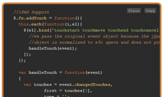
    2. jQuery add drag/touch support for iPad Useful jQuery Snippets and Plugins for iPad
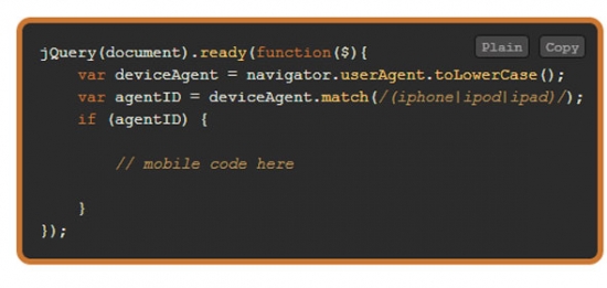
    3. jQuery detect Mobile Devices - iPhone iPod iPad
    Useful jQuery Snippets and Plugins for iPad
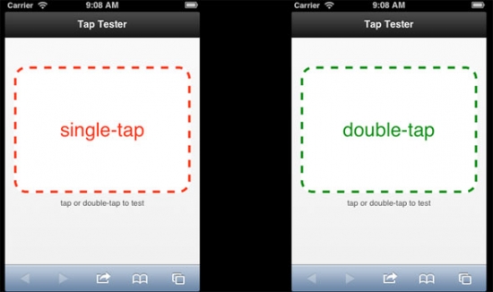
    4. Implementing doubletap on iPhones and iPads Useful jQuery Snippets and Plugins for iPad
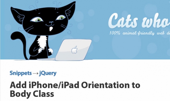
    5. Add iPhone/iPad Orientation to Body Class Useful jQuery Snippets and Plugins for iPad
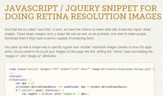
    6. Javascript / jQuery Snippet for doing Retina Resolution Images Useful jQuery Snippets and Plugins for iPad
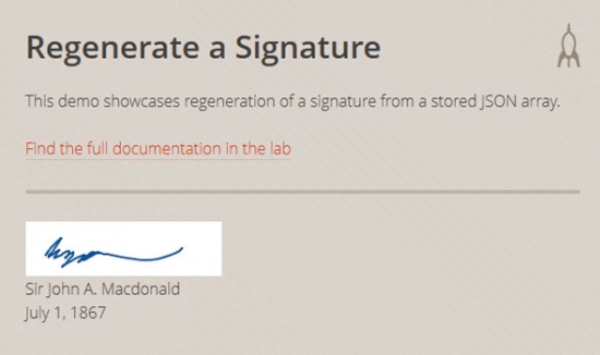
    7. Signature Pad Signature Pad
    8. iScroll
    Useful jQuery Snippets and Plugins for iPad
    9. GloveBox Useful jQuery Snippets and Plugins for iPad
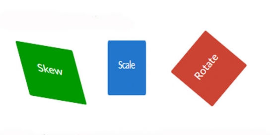
    10. Zoomooz.js Useful jQuery Snippets and Plugins for iPad
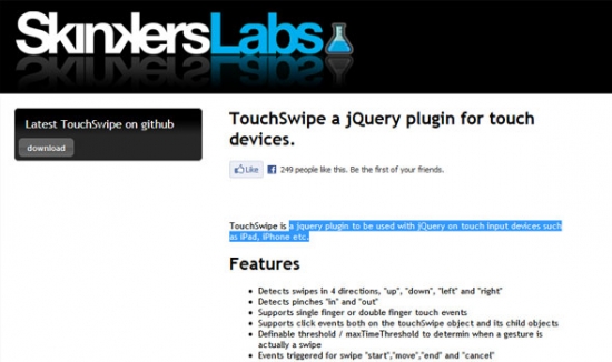
    11. TouchSwipe a jQuery plugin for touch devices TouchSwipe a jQuery plugin for touch devices.
    Slideshow jQuery compatible iPad, iPhone Android et autres mobiles Useful jQuery Snippets and Plugins for iPad

    Read more: http://www.webdesign.org/useful-jquery-snippets-and-plugins-for-ipad.22278.html
    Related Posts Plugin for WordPress, Blogger...